Our Design Process
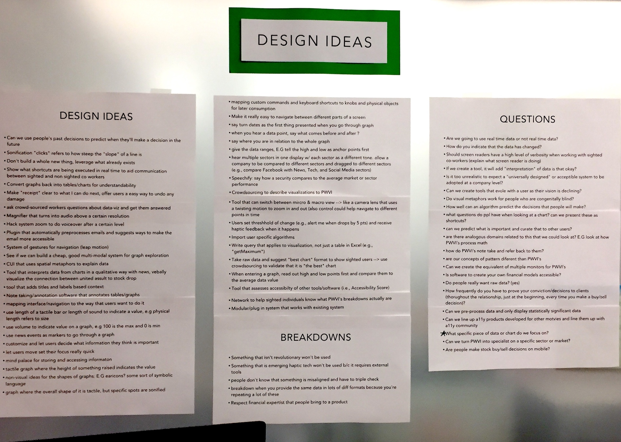
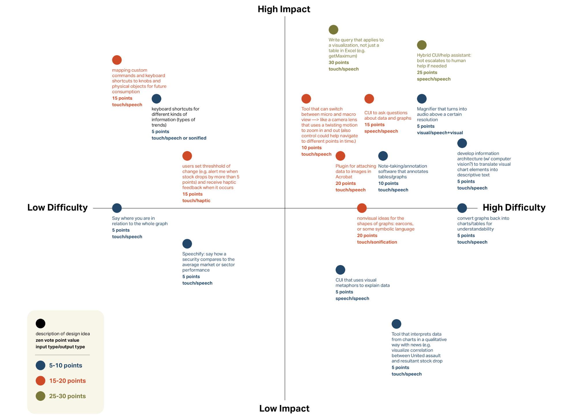
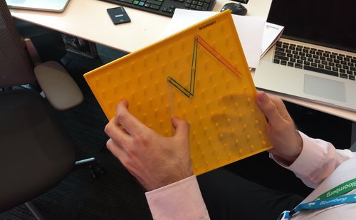
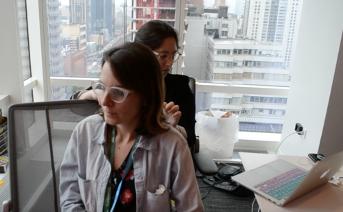
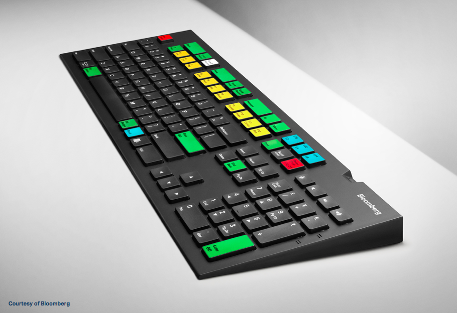
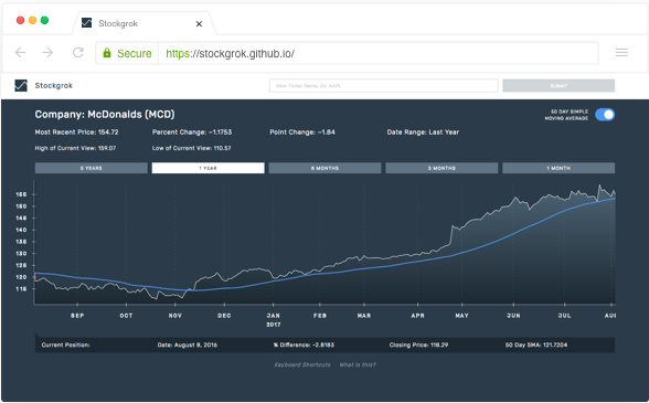
After the research phase of our project, we shifted gears towards product design. The first step involved generating as many ideas as possible, accomplished by annotating our affinity diagram. We voted on the most promising ideas, and plotted them on a matrix that addressed the difficulty and impact of each idea. Twelve of these ideas were rapidly prototyped by the team, and tested with employees at Bloomberg. In the ensuing iterative design phase, we prototyped and tested three different modes of navigation to sonified data and relevant spoken details. We user-tested our prototypes with people with visual impairments, and found that a keyboard system made the most sense for the existing financial expert workflow. We also found that we needed to focus on providing context to price history, regardless of the chart being explored. We decided to build a web-based final product that could easily integrate into existing systems, or stand alone. We user-tested our final product with both people with visual impairment and sighted finance experts, and found that both were able to pick up on nonvisual cues about the changing trends in a security’s price history.
